Even though best practices in table design have been well established for decades, I have found during my career as a technical editor that authors, editors, and graphic designers are often unfamiliar with them and sometimes have strong preferences for design elements that make tables harder to read. The fact that the built-in table styles in Microsoft Word are inconsistent with best practices does not help.
Tables and other visual elements such as graphs, diagrams, and photographs are a critical part of most scientific and technical writing because they help readers remember key points, understand complex processes, and see patterns, similarities, and differences. Tables are visual elements because they display information in a logical sequence of columns and rows.
Best practices in table design are important because designing a table that is effective is more complicated than you might expect. According to Scientific Style and Format, tables “can be the most difficult and time-consuming part of [preparing] a manuscript.”1,p678
Table Basics
Before we get to the best practices, following are a few basics about tables. Tables are commonly used to show:
- Comparisons, such as the advantages, disadvantages, and cost of the options to fix a problem
- Lookup information, such as the cost of nails of various diameters and lengths
- Precise values
- A large number of numerical values
- A summary of information
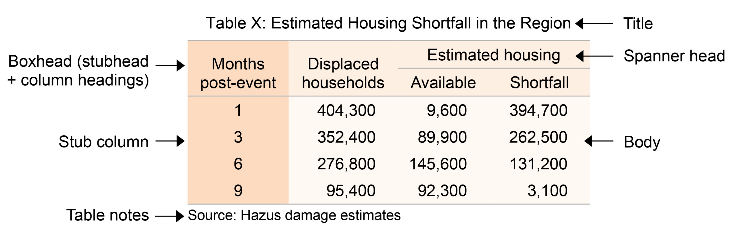
Figure 1 shows the basic components of a table. The left-most column, called the stub column, and the column headings contain the variables and are analogous to the x and y axes in a graph.
Best Practices
The best practices that are described below address the most common design issues that I see as a technical editor and are not comprehensive.
Nondata Elements
One of Tufte’s principles of data visualization is “above all else show the data,”2,p105 which means that nondata elements that are not necessary to make a table understandable should be omitted. Nondata elements include lines (called “rules” in typography), shading, and elements that are added strictly for visual appeal (e.g., color).
A few horizontal lines are required: above and below the boxhead, below spanner heads, above rows with totals, and below the bottom row, not including table notes.3 Lines should be as thin and light as possible. Vertical lines and other horizontal lines may be needed in complex tables, but deciding which ones, if any, are truly needed can be difficult. Added white space can be used for delineation instead of lines.
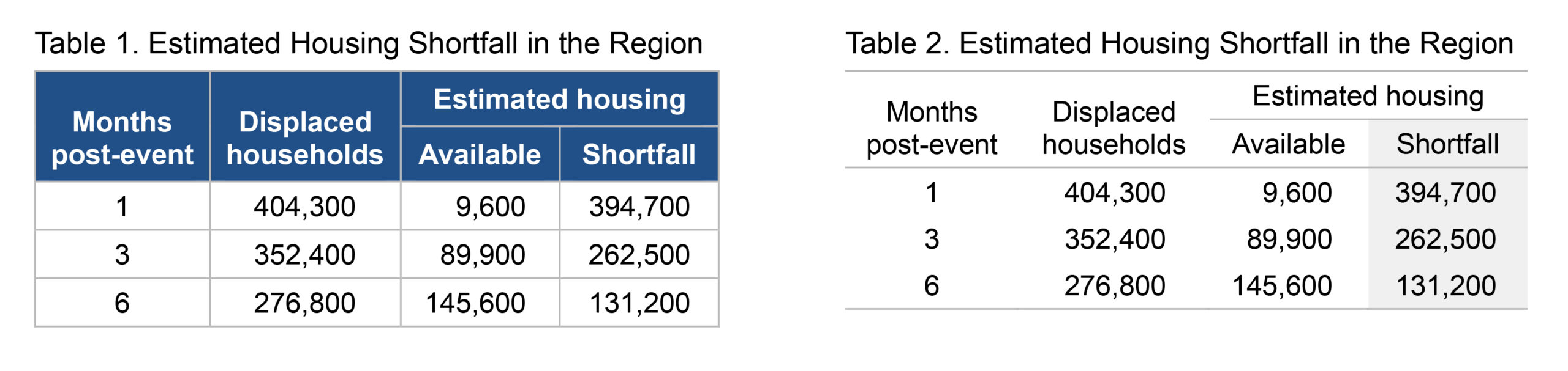
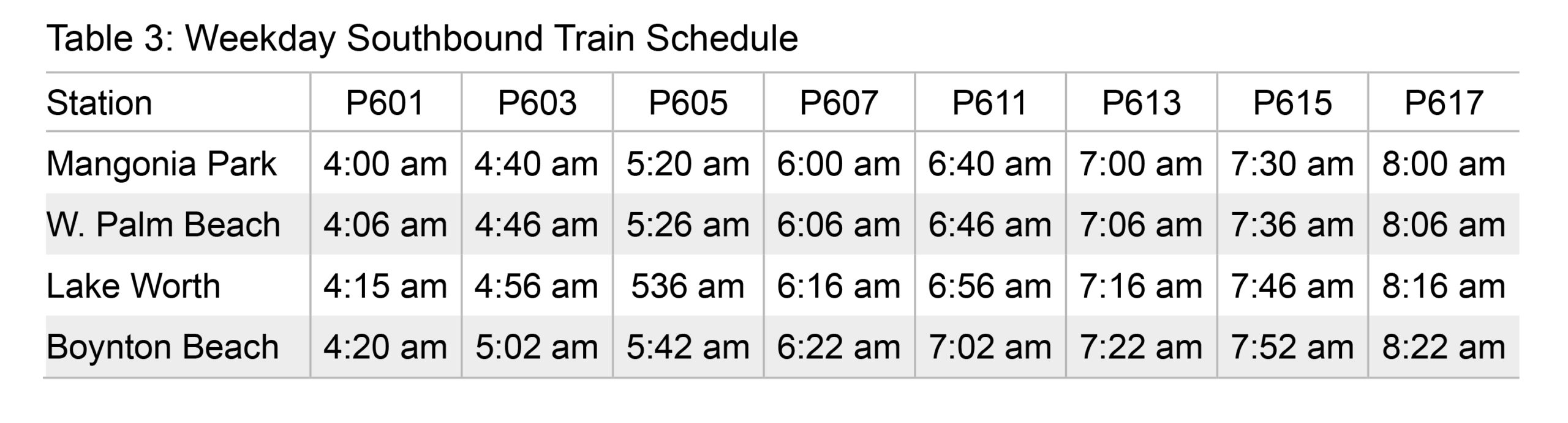
Table 1 has unnecessary horizontal and vertical lines that compete with the data and make the data harder to compare. Table 1 also has white text on a dark background (called “reversed type”), which is unnecessary and generally harder to read than nonreversed type.4 Table 2 is the same table without the unnecessary elements. The light shading in Table 2 is used to emphasize the data the author wants to highlight and is one type of shading that can be effective. The reason for the shading should be explained in the description of the table (e.g., “Note the shortfall …). Zebra striping in a table with a lot of columns is another type of light shading that can be useful. Table 3 is an example.
Arrangement
Important factors to consider when deciding how to arrange information in a table are as follows:
- Numbers are easier to compare down columns than across rows.5
- Time-series categories should be across columns.6
- Calculated values in a column that are derived from values in other columns should be to the right of the values the calculations are derived from.6
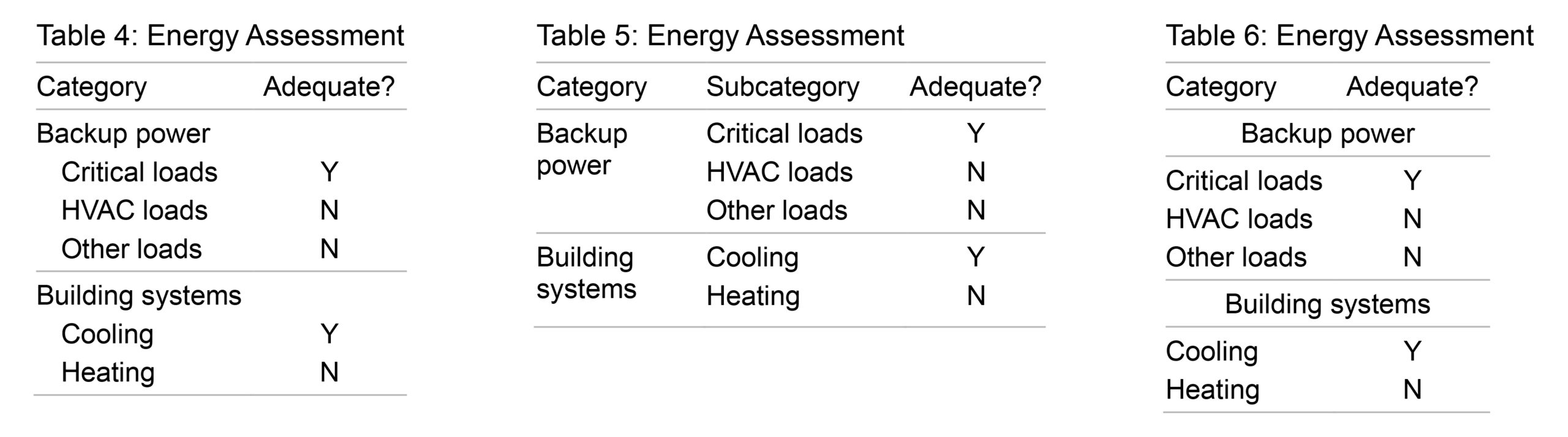
- When the stub column has entries and subentries, indenting the subentries or putting them in a separate column is better than putting the entries in cut-in rows that span the width of the table (see Tables 4, 5, and 6, respectively)
Treatment of Text
Horizontal alignment. Left-aligned text should be the default because it is easier to read than centered or right-aligned text.7 Text in the stub column should always be left-aligned.3 Column heading alignment should match the column alignment except that right-aligned columns should have centered headings.3
Capitalization. Sentence case should be the default because it is easier to read than title case (or headline style), and title case is easier to read than all caps.7 In addition, sentence case requires less space than title case and all caps.
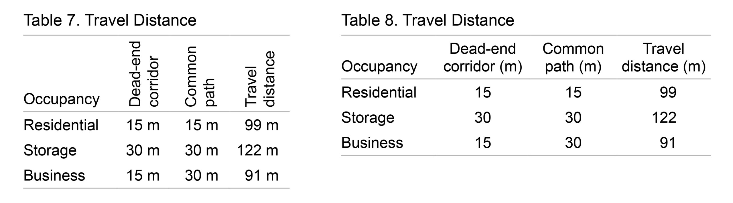
Text direction. Text should be horizontal because text in any other direction is hard to read.6 Long column headings may be abbreviated if the meaning is clear3 to allow them to be horizontal. Sometimes flipping the columns and rows allows for horizontal text if doing so does not cause other problems. Tables 7 and 8 show a comparison of vertical and horizontal text.
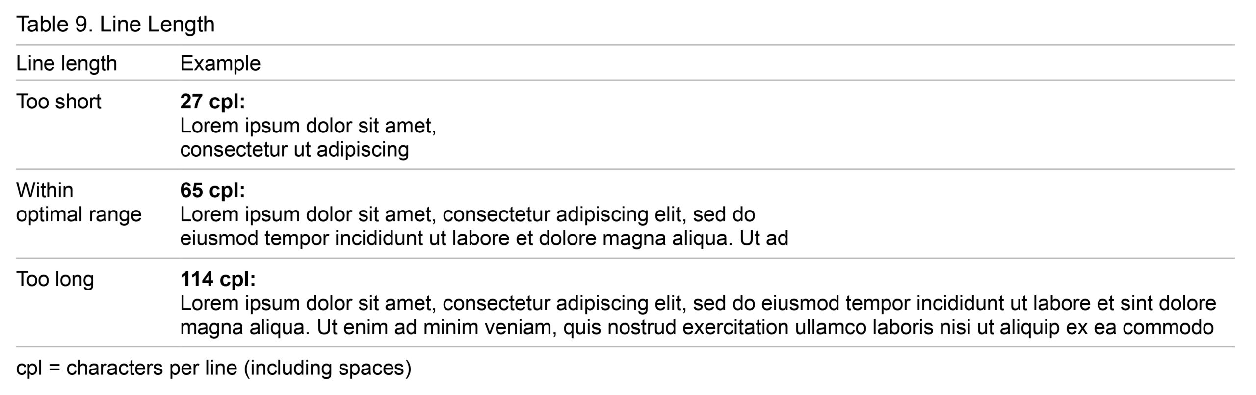
Line length. Line length is an important factor in readability in general, not just in tables. Lines that are too short require the eye to change direction every few words, which is tiring. Lines that are too long make finding the next line difficult and affect the reader’s focus because the brain is energized at the beginning of a line, but the focus dwindles over the duration of the line.8
Line length can be measured in characters per line (cpl), including spaces. According to Butterick, the recommended range is between 45 and 90 cpl,9 and according to Schriver, the optimal range is 50 to 70 cpl.10 Other sources recommend slightly different ranges. Table 9 shows line lengths that are too short, within the optimal range, and too long.
Alignment of Numbers in a Column
Numbers in a column should be aligned as follows:
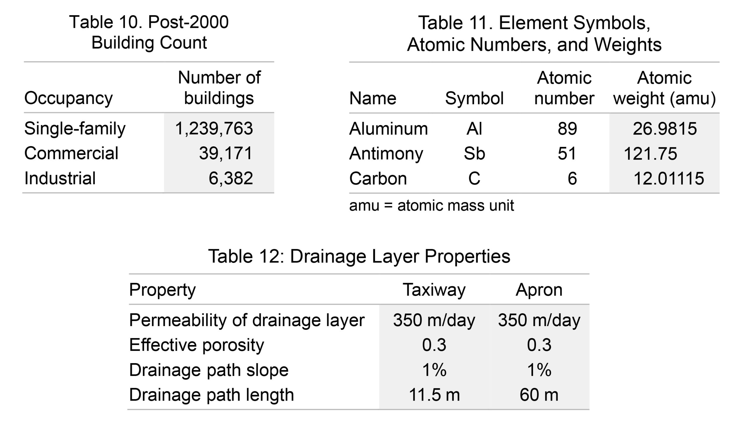
- Right-aligned: Numbers with the same unit of measure and same number of decimal points, including none1 (see Table 10)
- Decimal-aligned: Numbers with the same unit of measure and different number of decimal points11 (see Table 11)
- Left-aligned or centered: Numbers with different units of measure1 (see Table 12)
Columns
Headings. Every column should have a heading except the stubhead, which may be omitted if the entries in the stub column are self-explanatory or too different to make a heading possible.3 Column headings should be as brief as possible3 and as noted earlier, may be abbreviated if the meaning is clear.
Space between columns. Column width depends on column content, but the space between columns in a given table should be consistent and the minimum needed to delineate columns visually.12 Tables are sometimes stretched so they span the page margins or column width, but unnecessary space between columns makes tables harder to read.
Vertical Alignment
Column headings that occupy two or more lines should align on the lowest line.3 Nonheading rows with multiple lines should align at the top.6 Few says to “be careful to align the edges of text … so readers … can scan down and across without disruption.”6,p124 Vertically centering text in a row is disruptive because the eye has to jump unnecessarily. Tables 13 and 14 show incorrect and correct vertical alignment, respectively.
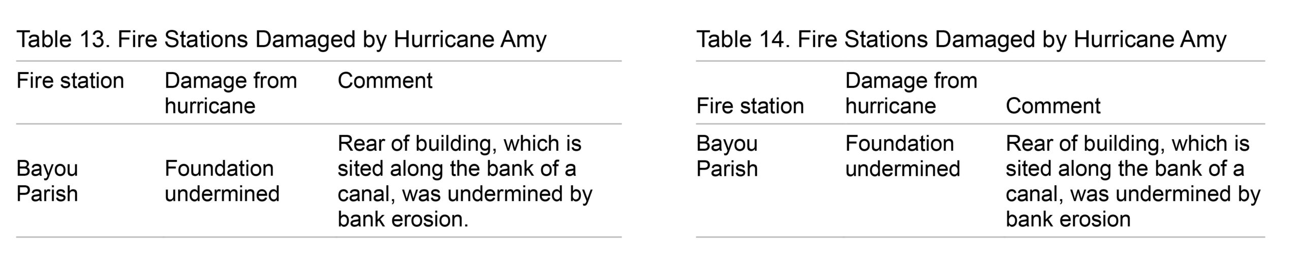
Table Titles
The table title should be above the table.3 The Chicago Manual of Style recommends sentence case for table titles but recognizes that title case is traditional.3 The title of every table should be unique, concise, and informative6 and “should not suggest any interpretation of the data.”3,p135
Table Notes
Table notes should be listed in this order: source of the data, referenced notes in the table, and definitions of acronyms and other abbreviations used in the table.3 Deciding whether to define all, some, or none of the abbreviations that are used in a table is a stylistic choice and beyond the scope of this article.
A Final Note
If the tables in a manuscript that I am editing are not well designed, I normally suggest to the author that the tables would be easier to read if they adhered to best practices in table design. In my experience, authors are more likely to accept the suggestion if I provide before-and-after examples of one or more of the tables in the manuscript.
Adhering to best practices in table design is a win for readers and for more effective communication of information!
References and Links
- Huth EJ. Scientific style and format: The CBE manual for authors, editors, and publishers. 6th ed. Chicago: The University of Chicago Press; 1994.
- Tufte ER. The visual display of quantitative information. Cheshire, CT: Graphics Press; 2001.
- The University of Chicago Editorial Staff. The Chicago manual of style. 17th ed. Chicago: The University of Chicago Press; 2017.
- Wheildon C. Type & layout. Berkeley, CA: Strathmoor Press; 1996.
- Tinkelman DP. Introductory accounting: a measurement approach for managers. New York: Routledge; 2016.
- Few SC. Show me the numbers: designing tables and graphs to enlighten. Oakland, CA: Analytics Press; 2004.
- Kimball MA, Hawkins AR. Document design: a guide for technical communicators. Boston: Bedford/St. Martin’s; 2008.
- Holst C. Readability: the optimal line length. [accessed November 5, 2021]. https://baymard.com/blog/line-length-readability.
- Butterick M. Butterick’s practical typography. 2nd ed. [accessed November 5, 2021]. https://practicaltypography.com/.
- Schriver KA. Dynamics in document design. Hoboken, NJ: John A. Wiley & Sons; 1997.
- Covey S. FranklinCovey style guide for business and technical communication. Salt Lake City: FranklinCovey Co.; 2012
- Rutter R. Web typography: a handbook for designing beautiful and effective typography in responsive websites. London: Ampersand Type; 2017.
Diana Burke, ELS, Senior Technical Editor, AECOM.
Opinions expressed are those of the authors and do not necessarily reflect the opinions or policies of their employers, the Council of Science Editors or the Editorial Board of Science Editor.