Introduction
Equal access to web content is long overdue. Publishers must ensure that content is accessible to people who are blind, deaf, neurodivergent, color blind, lack contrast sensitivity, or who use tools other than a mouse to operate their computer.
I am a user experience designer and a former web developer. As a developer, I spent years coding accessible content for U.S. government websites. This article will identify some coding conventions that will make websites more accessible.
Publishers can begin to address the needs of all users with coding conventions that make websites more accessible. These efforts will be furthered by an understanding of how people navigate the web with screen readers, and an awareness of how different people view color. This article will focus on strategies around color and for screen readers.
Test Your Site Without Using a Mouse
As a first step in reviewing a website for accessibility, consider that some people navigate websites without a mouse. A customer with quadriplegia may use a mouth-operated controller, and a reader with a broken arm may tab through a website.
It’s easy to test a website without a mouse and it’s critically important to do so. Tab through all of the elements and make sure that all parts of the navigation, all form fields, and all other elements can be accessed without a mouse. Elements that cannot be accessed without a mouse should be recoded to make them accessible.
Screen Readers
A screen reader is a software program that reads content aloud. Screen readers are utilized by people who are blind or who have reduced vision or dyslexia. Screen reader functionality is built into several operating systems, including Microsoft Windows 10/11, Apple’s macOS, Google’s Chrome operating system, and on mobile devices running iOS or Android.
Test Your Website With the Screen Reader on Your Computer
Every publisher should test their website with a screen reader. Below are tutorials for using the screen readers native to different operating systems:
- Microsoft Windows screen reader tutorial1
- Chromebook screen reader tutorial2
- Mac screen reader tutorial3
- iPhone screen reader tutorial4
- Android screen reader tutorial5
After you watch one of these tutorials, turn on your screen reader and navigate your website without a mouse.
When testing with a screen reader, it’s important to test the functionality commonly used by screen reader users. Many screen reader users are blind and do not use a mouse, so it’s important to avoid using a mouse when testing. It’s also important to test commonly used screen reader functions including the Links List and the Headings List. These lists allow screen reader users to jump to a specific heading or link on a web page.
Headings
When this article first loaded in your browser, did you skip past the introduction and jump down to another section? Scanning articles for headings is a common reading behavior.6
When I conduct usability tests with people who are blind, I ask them: “What is the first thing you do on our website?” Each person has told me that they open the headings list in their screen reader. When you first look at an article, such as this one, chances are you scan it and look for section headings. Screen reader users do this, too. However, screen readers only detect headings if they are coded as headings. To be coded as a heading, the text must be contained in HTML heading tags such as <h1>, <h2>, <h3>, <h4>, <h5>, or <h6>. This is reviewed in the following examples.
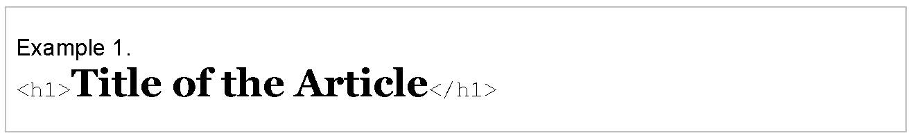
Level 1 headings. Level 1 headings have the highest hierarchy on the page. On an article, the title of the article should use a Level 1 heading (Figure 1). This means that it should be coded with <h1> tags. Level 1 headings often have the largest font size on a page to help people identify their importance in the hierarchy. There should only be one level 1 heading on each page.
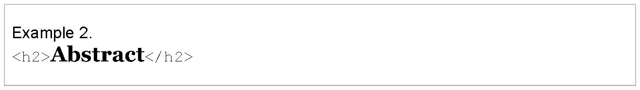
Level 2 headings. Level 2 headings come after a level 1. On an article page, the headings for “Abstract,” “Introduction,” and “Results” should be coded with an h2 tag (Figure 2). There is no limit to the number of h2, h3, h4, h5, or h6 headings on a page.
Text that is coded with heading tags will appear in a screen reader’s headings list. This allows screen reader users to jump to each of those headings. If they choose the “Abstract” heading, their screen reader will move to the abstract, and if they choose the “Results” heading, the screen reader will move to the results section of the article.
Unfortunately, sometimes developers code section headings without using heading tags. Big, bold text that breaks up a section may be visually attractive to sighted users, but screen readers will not detect it as heading text if it is not coded correctly, preventing users who depend on screen readers from navigating the article. Developers must avoid using alternate tags to code headings, and publishers should establish coding standards to ensure that WCAG guidelines7 are followed.
Headings in Word Processing Programs
Word processing programs such as Microsoft Word8 and Google Docs9 use headings. Adding headings to documents makes them more accessible to screen reader users. Utilize the headings options with this software to make documents accessible to screen reader users.
Links Should Be Understood out of Context
Scholarly articles have links to references near the end of the document. Sometimes readers open articles they’ve read before just to get to that list of references. Imagine that you were one of those readers—and that you were blind. You’ve loaded an article in your web browser. You know the references are linked at the end. Do you really want to listen through an article you’ve read multiple times just to get to the links at the end?
Screen readers have a solution for this: the Links List. Similar to the Headings List, the Links List reads aloud all of the links on a page. It reads the link text that sighted readers usually recognize as blue and underlined. The problem is that the Links List only reads the hyperlinked text; it doesn’t read the text before it or after it. Thus, the Links List does not provide additional context outside of what is linked.
Imagine that an article has 35 references. Each of those references is listed in paragraph text (i.e., nonlinked text) with links to that reference in Google Scholar, PubMed, etc. Screen readers only read the hyperlinked text. This means that a screen reader user will hear something like this: Google Scholar, PubMed, Google Scholar, PubMed, Google Scholar, PubMed. It will read “Google Scholar” 35 times without knowing which reference that link is referring to.
Developers have a couple of workarounds for this. The preferred method10 is to add hidden text to each link11 that is read aloud by screen readers but hidden from the view of sighted readers.
Or, they can add an aria-label attribute to each link. Aria-label attributes contain hidden text that is read by screen readers; that text provides context to the hyperlink text. One drawback of aria-label attributes is that some browsers may not translate aria-label text when the browser translates that text to another language.
A common mistake developers make is relying on the title attribute to add context to a hyperlink. This is a mistake because some screen readers do not read the text in the title attribute on hyperlinks by default.12 You don’t need to understand HTML to check for this functionality. Test your website with a screen reader and open the Links List. If the links cannot be understood out of context, ask your development team to add hidden text to those links.
Alternative Text
Images can be described to screen reader users if alternative text (i.e., alt text) is provided. Alt text is an attribute added to the code for an image. This can be challenging for complex scientific figures, but it’s important to provide a text alternative for screen reader users.
Use Text Instead of Images of Text
Avoid placing text on an image. I’ve seen publishers convert data tables into images; this should be avoided. Text should be coded as text to be accessible to more readers.
If the image must include text, as is common on websites like Instagram, add alt text to the image. Below are resources showing how to add alt text to images in Microsoft Word, Twitter, Instagram, and Facebook:
- How to add alt text to Word documents13
- How to add image descriptions in Tweets from Twitter14
- How to edit alt text for images on Instagram15
- How to edit alt text for images on Facebook16
Accessibility for Non-Screen Reader Users
Color Contrast
Text needs to have sufficient color contrast compared to its background. For most articles, the text color needs to have a contrast ratio of 4.5:1 compared to its background color.17 Your designers can test their typography colors with a tool such as WebAIM’s contrast checker.18
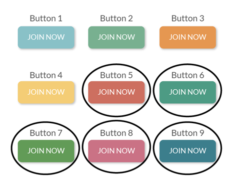
Maintaining a legible text color is easy for articles. It gets trickier when designing calls to action that need to stand out, such as buttons to “subscribe,” “join,” or “learn more.” Figure 3 illustrates nine calls to action with white text and the words, “JOIN NOW,” each in a different color. The first four calls to action have pale backgrounds: light aqua blue, muted light green, orange, and yellow. These all lack sufficient contrast compared to their white text. The last five calls to action are darker and include brick red, deep muted green, a dark spring green, dark pink, and rich teal. These color combinations have sufficient color contrast while the first four lighter colors do not.
Links Should be Underlined
Links should be easy to identify for everyone. They should not rely on color alone or on a hover state to be identified. Links that are only identifiable by color may not be recognized by people who are color blind or with a lack of visual contrast sensitivity. Links with an underline that only appears on hover may not be recognized by people who navigate without a mouse and therefore cannot hover over them. The easiest solution to this is to underline all links.
Link Color Contrast
Links should also be in a color with a contrast of 3:1 compared to their surrounding text.19 For example, if the article text is black, the link color should be a bright blue that stands out, as opposed to a dark muted blue that is harder to detect.
Don’t Use Color Alone to Convey Information
One of the WCAG accessibility guidelines warns us to avoid using color to convey meaning.17 Avoid assigning meaning to colors because some people in the audience identify colors differently. This can be challenging with scientific figures. Figure 4 is an example of a pie chart that uses color to convey meaning. In this fictional pie chart, the large red slice represents a large quantity of fruit, and the small green slice represents a small quantity of vegetables. The image on the left shows this pie chart in red and green. The image on the right shows the view for someone with deuteranopia (red/green color blindness). The two slices are difficult to differentiate in the deuteranopia view.
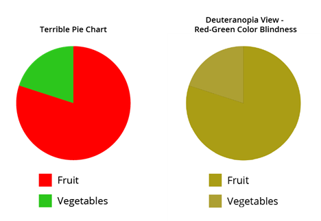
Figure 5 is a pie chart with the same quantities and similar colors. The key difference is that the quantities are listed in text in Figure 5; fruit: 80%, vegetables 20%. Listing the quantities makes the information accessible to people without relying on color. When an image like this is presented on a website it must also have alternative text that includes the quantities to make the data accessible to screen reader users.
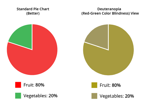
Figure 5 has a couple of visual improvements over Figure 4. In Figure 5, the pie chart slices are separated by a thick white border. This helps differentiate the pie slices for people with color blindness. Using Adobe Illustrator to simulate the deuteranopia view also allowed for adjustment to the shades of red and green, making them a little more distinguishable.
Technical Standards: WCAG
This article highlights some easy changes to help publishers make websites more accessible.
Development teams should carefully review the WCAG standards7 (the current version, as of January 2022, is WCAG 2.1). These include topics not covered in this article, such as captioning for videos, keyboard traps, etc.
Test your website with a screen reader—and without a mouse!—and follow WCAG standards to make your website accessible to everyone.
References and Links
- https://youtu.be/EiQ8NwdsZCY
- https://youtu.be/fpbIsN31hLM
- https://youtu.be/5R-6WvAihms
- https://www.youtube.com/watch?v=qDm7GiKra28&t=75s
- https://youtu.be/0Zpzl4EKCco
- Nielsen J. How users read on the Web. Nielson Norman Group. [accessed March 21, 2022]. https://www.nngroup.com/articles/how-users-read-on-the-web/.
- https://www.w3.org/TR/WCAG21/
- Microsoft. Improve heading accessibility. [accessed March 21, 2022]. https://support.microsoft.com/en-us/office/video-improve-accessibility-with-heading-styles-68f1eeff-6113-410f-8313-b5d382cc3be1#:~:text=To%20add%20a%20heading%20style%20to%20text%20in%20Word%2C%20select,the%20benefits%20of%20your%20headings.
- Google Workspace. Create a heading in Google Docs. [accessed March 21, 2022]. https://youtu.be/uVQIleTVwCI.
- WC3 Working Group. H33: supplementing link text with the title attribute. [accessed March 21, 2022]. https://www.w3.org/TR/WCAG20-TECHS/H33.html.
- WC3 Working Group. C7: using CSS to hide a portion of the link text. [accessed March 21, 2022]. https://www.w3.org/TR/2016/NOTE-WCAG20-TECHS-20161007/C7.
- Panchang S. Text links: best practices for screen readers. Deque. [accessed March 21, 2022]. https://www.deque.com/blog/text-links-practices-screen-readers/.
- https://support.microsoft.com/en-us/office/add-alternative-text-to-a-shape-picture-chart-smartart-graphic-or-other-object-44989b2a-903c-4d9a-b742-6a75b451c669
- https://help.twitter.com/en/using-twitter/picture-descriptions
- https://help.instagram.com/503708446705527
- https://www.facebook.com/help/214124458607871
- WC3 Working Group. Use of color: understanding SC 1.4.1. [accessed March 21, 2022]. https://www.w3.org/TR/UNDERSTANDING-WCAG20/visual-audio-contrast-without-color.html.
- https://webaim.org/resources/contrastchecker/
- WC3 Working Group. G183: using a contrast ratio of 3:1 with surrounding text and providing additional visual cues on focus for links or controls where color alone is used to identify them. [accessed March 21, 2022]. https://www.w3.org/TR/WCAG20-TECHS/G183.html.
Nina Amato (ORCID: 0000-0002-0621-7759) is Lead User Experience Designer, American Chemical Society.
Opinions expressed are those of the authors and do not necessarily reflect the opinions or policies of their employers, the Council of Science Editors, or the Editorial Board of Science Editor.