The goals of responsible communication of science include accuracy, clarity, and consistency. Writers and editors should also aim for equity and accessibility. These goals should apply to every part of the content: text, tables, citations, data display, and any supporting elements. A number of sources offer guidance on inclusive language,1 but these resources have focused less attention on accessibility of data display, in particular graphic presentations of data. (However, see the helpful section in the APA Publication Manual on choosing color in figures.2)
Some individuals have a color vision deficiency (often called “color blindness”). The most common presentation is “red-green” deficiency, with difficulty distinguishing between red, yellow, and green; sometimes the colors red and black are difficult to distinguish as well. There are other presentations of color vision deficiency, including blue-yellow and achromatopsia, the very rare occurrence of complete lack of color perception.3
To illustrate how a figure prepared without consideration for color vision deficiency might look, consider the following figures. Figure 1 is how people without any color vision deficiency will see the green, red, and blue lines.
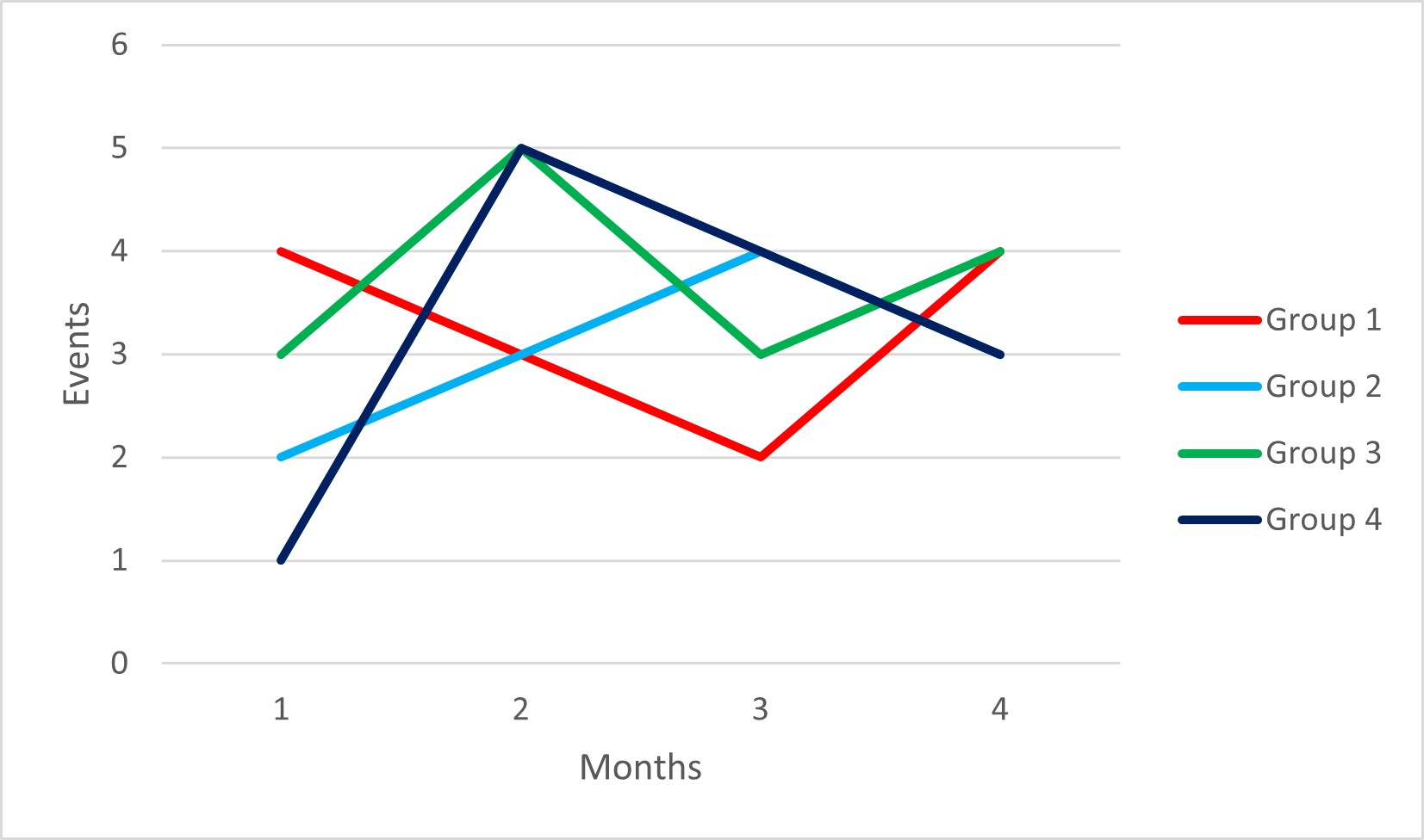
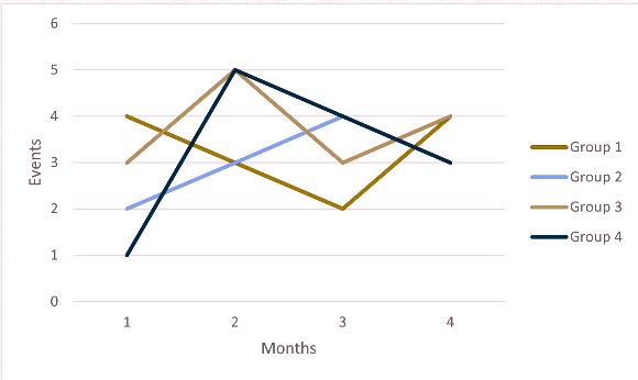
Figure 2 is how someone with a red-green color deficiency would see the same lines, with data for groups 1 and 3 very difficult to distinguish.
Tools and Tips for Building Graphics
What are some things to keep in mind when creating or editing graphics? First, avoid just accepting the default colors or shading that the software generates. Remember that red and green are the most predominant colors affected by color vision deficiency, so avoid using both of them, especially in close proximity.4
Second, consider using only black and white with shading or patterns instead. The graphic above is recreated as a black-and-white display in Figure 3.
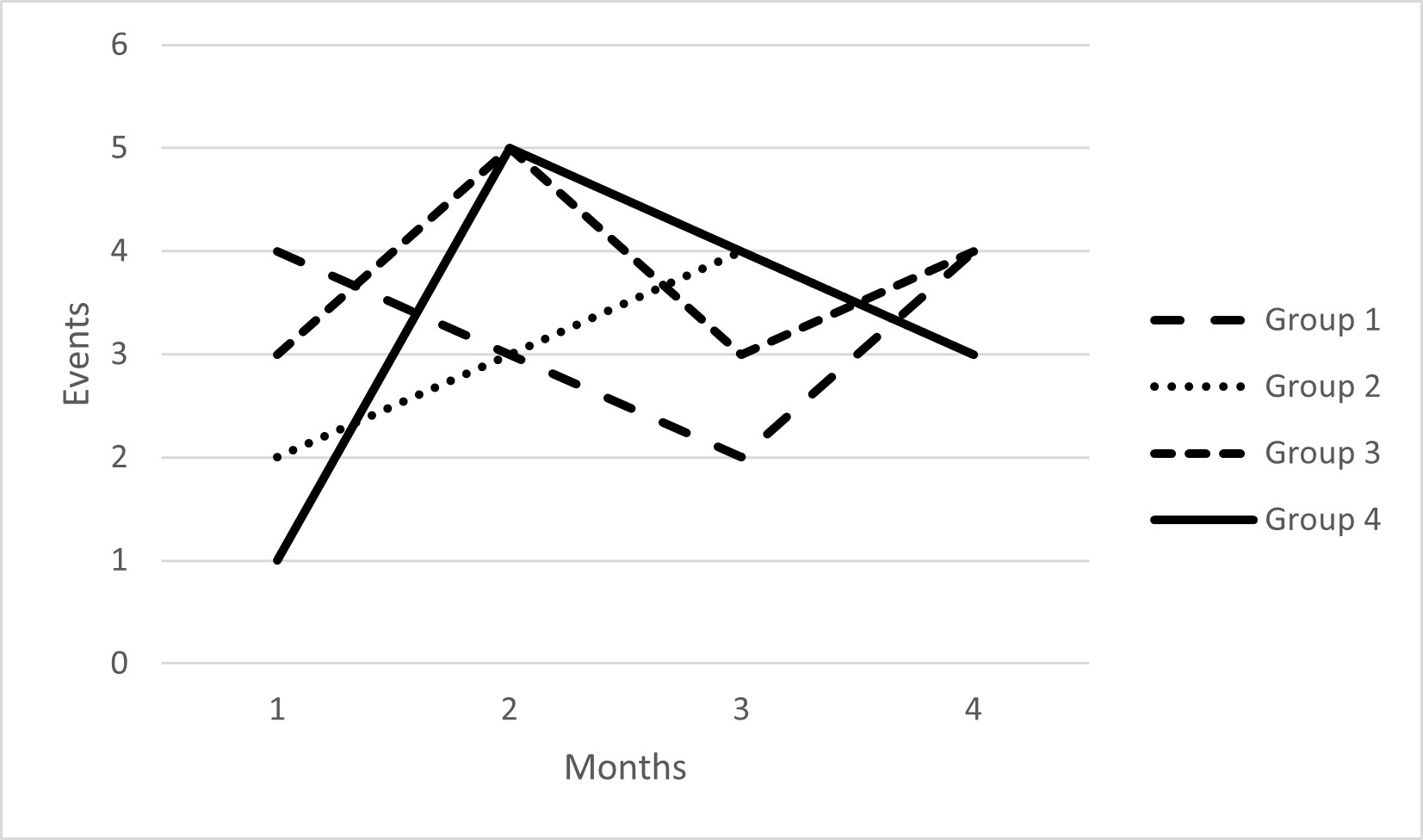
One word of caution: there are a limited number of line weights available in most graphic software; lines that cross, overlap, or run very close together may be hard to follow when multiple patterns are used.
Third, explore some of the color palettes that have been designed specifically for people with all visual abilities, such as Adobe Color and Color Universal Design palette.5
Fourth, check any figures for display issues. Adobe Illustrator offers the ability to toggle between different views that simulate 2 types of color vision deficiency (protanopia [red] and deuteranopia [green]) to ensure that text and images are discernable.6 In addition to the built-in functionality of Illustrator, there are a number of tools that can simulate different color vision deficiency views:
- Color Check for ADA Image Compliance https://www.oss-usa.com/color-check-ada-image-compliance
- Coblis (Color Blindness Simulator) https://www.color-blindness.com/coblis-color-blindness-simulator/
- Color Oracle https://colororacle.org/
Even for people without any limitations in distinguishing colors, how they view the graphics may be a factor in interpretation. Data display can be device dependent; for example, reading content on a small smartphone screen or using a computer monitor with very low resolution may obscure small differences, particularly in figures with more than a few categories graphed.
Displays for Individuals With Vision Impairment or Blindness
Data displays are also a challenge for individuals with vision impairment or blindness. Publishers are beginning to adopt technologies to aid in accessibility of text and numerical data, but access to data in graphical displays is still largely prohibitive. This complex and important area will be the focus of a future column highlighting some initiatives and technologies that have been developed.
Acknowledgment
The image in Figure 2 was prepared using Coblis (Color Blindness Simulator) at https://www.color-blindness.com/coblis-color-blindness-simulator/.
References and Links
- Frey T, Young RK. Correct and preferred usage. In: Christiansen S, Iverson C, Flanagin A, et al., editors. AMA manual of style: a guide for authors and editors. 11th ed. Oxford University Press; 2020. Updated November 28, 2022. https://academic.oup.com/amamanualofstyle/book/27941/chapter/207567296
- Accessible use of color in figures. APA style. https://apastyle.apa.org/style-grammar-guidelines/tables-figures/colors
- Color vision deficiency. American Optometric Association. https://www.aoa.org/healthy-eyes/eye-and-vision-conditions/color-vision-deficiency?sso=y
- Katsnelson A. Colour me better: fixing figures for colour blindness. Nature. 2021;598:224–225. https://doi.org/10.1038/d41586-021-02696-z
- Masataka Okabe and Kei Ito’s Color Universal Design palette. https://nanx.me/oneclust/reference/cud.html
- Escalada J. How to design for color blindness. illustratorHow blog. Updated July 14, 2022. https://illustratorhow.com/design-for-color-blindness/
Stacy L Christiansen, MA, Managing Editor, JAMA; Chair, AMA Manual of Style.
Opinions expressed are those of the authors and do not necessarily reflect the opinions or policies of the Council of Science Editors or the Editorial Board of Science Editor.